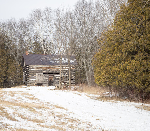
One more and final post from my pre-New Year romp with Bob. On our way home but still way out in the country, we passed a tumbledown barn.
I thought the lines in the field made a very nice lead-in to the barn.
I had only ported my one, normal lens, so I needed to crop in post to get closer, but I do prefer the original, longer view shown above.
Sometimes, and by that I mean often, getting any sort of foreground element improves the photo. While stray branches aren't necessarily the best foreground element, I think that maybe they help a little in this case. Another plus is that they are also acting as bit of a frame. Of course, the distance is greater so the barn is smaller, and that is not a plus. What do you think of the three versions?
In that ↑ photo you see an old house. I did much cropping, but in a different photo, to isolate the house.
I did a b&w conversion of a similar but not identical crop. I like the colour better though. But you don't know until you try.
All in all, it was a most pleasant morning, riding around with a friend of like-interest and making various stops.


I will go out on a limb here & say I like photo #1 of the three - the longer view of the lines drawing the eye to the barn was easier to look at. My 2nd favourite would be the one that includes the old house.
ReplyDeleteIf I saw these photos without any commentary, I think I'd like the last the best, but with knowing how you took them and edited them, I'll agree with numero uno!
ReplyDeleteI like the first one the best.
ReplyDeletei like one the best and #3 second. I find that framing and lines work for me as well.
ReplyDeleteLove the shots of the old barn, AC. I feel sad to see such structures disappearing that way though.
ReplyDeleteThese pictures look bleak but interesting. I am glad that you had such a good time with Bob.
ReplyDeleteThe framed shot is the best from a classic style point of view, in my opinion. And I agree with you that the colour of the old house is better than the b and w.
ReplyDeleteLovely work. Clever to use the tracks for a lead-in. I like all of them a lot.
Here's wishing you many more productive drives!
My preference is for the first image and perhaps converting to monochrome would enhance the leading lines, just wondering. It must indeed have been enjoyable to go on photo expeditions with your friend, Bob.
ReplyDeleteYou have my vote for #1 too.
ReplyDeleteI like each of them.
ReplyDeleteBeautiful images…. All of them.
ReplyDeleteIt is interesting that I feel a sense of melancholy at seeing the grand barn weakened and in decline.
PipeTobacco
I like the longer view, too. :)
ReplyDeleteThat's a rather picturesque old farmstead.
ReplyDeleteI like all of the pictures, for different reasons.
ReplyDeleteNumber 1! I also like those tracks leading to the barn. It tells a story.
ReplyDeleteI'm not a fan of monochrome, so the colored pic works for me.
Happy New Year!
Never know how things will come out. Unless we try.
ReplyDeleteCoffee is on and stay safe
I love the first one of the barn and the black and white of the house. But they are all great!
ReplyDeleteHowever it only had a limited appeal. It was almost like a fairytale happening that by 1992, only 25 short years of initial implementation, 40% of the calls on AT&T's long distance network became Toll Free calls.
ReplyDelete