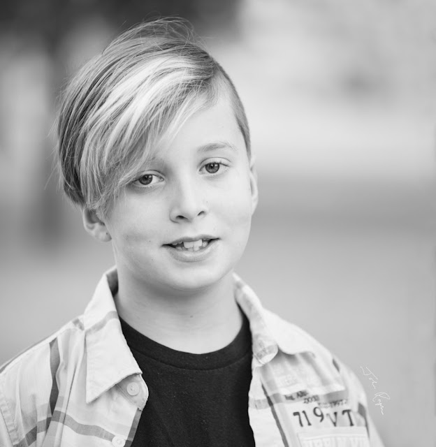
When it came down to a decision, however, I opted for the b&w version in JJ's case.
Maybe some prefer the colour rendition. Which one would you have printed?
I did alter the crop in printing by trimming both from the top and bottom. This allowed me to print it slightly wider that the more squarish version above. I chose to print it off centre, which worked well for Danica's print, but I think I should have centered this one. But I can live with it.
And . . .


My vite would be for the b&w version as well and I liked the way you cropped JJ’s portrait.
ReplyDeleteI like the b&w one best too. You do a great job on them, AC.
ReplyDeleteWonderful photos.
ReplyDeleteWhere do you print them, AC?
I have a printer.
ReplyDeleteVoting for colour because of the eyes.
ReplyDeleteI agree with your choice. They were all great, but that is outstanding.
ReplyDeleteIt's a nice picture grampa, and don't worry. He'll outgrow it.
ReplyDeleteI must vote for the last photo of course, because it shows the man behind the creation of his photo.
ReplyDeleteI'd say the black and white one.
ReplyDelete