Today, with very little comment, we present a few maps about Canada and the USA.
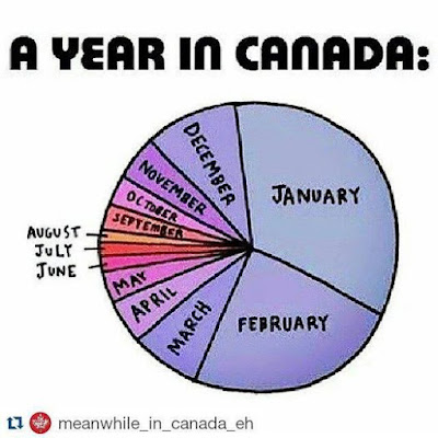
However, we begin with a chart that reveals the duration of the months in Canada. Sad but true, it has been scientifically verified by assiduous peer review.
Fifty per cent of Canadians dwell under the red line. I, in point of fact, have lived all of my life in this tiny zone.
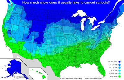
Along with the northern states, we require more snow before we cancel school. Of course we do. Otherwise, we'd all have a maximum grade 2 education.
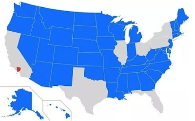
Now for the USA. Consider population density ↓ when you see those election maps. Each of the states in blue have a population that is less than Los Angeles County.
In another view, the two orange regions have the same number of people as all of the red region.
Finally, a map of the states ranked by healthiness where blue is best and red is worst.


Interesting maps, especially the months in Canada! I always thought my Canadian sisters' summer started halfway through mine and was over before you knew it!
ReplyDeleteIn the US the red states are largely empty land!
Interesting maps, especially the one of health status in the US of A. And now with two years of home online schooling should there ever be another school is cancelled because of snow (lol, but not)?
ReplyDeleteI can’t get past that first graphic really. I’m stuck in winter.
ReplyDeleteWow. Everyone of those maps is informative. Where did you find these?
ReplyDeleteOnce again I live in a purple state where, in my opinion, March lasts a lot longer than it seems to in your world. But you see, we go south in February, which makes February seem short, and then we come home in March expecting spring and ... it ... never ... comes.
ReplyDeleteVery enlightening about your life...and mine..a purple health-wise state. Half of the Canadians really live below that red line? I know there are the most important ones...ok, you live there so I trust you.
ReplyDeleteReally interesting maps. I would make March a bit bigger on the year in Canada map.
ReplyDeleteYes, winter really does define us.
ReplyDeleteI find the factoid about 50% of Canadians living below the red line fascinating. It really makes me want to move to northern Canada if it weren't for the one about how long each month feels like.
ReplyDeleteAs for the healthy graph, I guess it is obviously strictly physical health which is directly related to relative wealth and access to nutritious foods. But I wonder if they consider the poor air quality, stress levels and mental health of living in densely populated urban areas as part of their "healthy" equation. California is bright blue on the graph and yet ranks 45th for age of population among all 50 states. This either signals that the old don't live long there or they leave and go so other less stressful states to live out their years.
Two comments. This is why Americans love visiting in Canada AND thank goodness for PLanned Parenthood and wished it worked better.
ReplyDeleteInteresting info.
ReplyDeleteIntriguing and thoughtful!
ReplyDeleteThanks for posting these. Very interesting!
ReplyDeleteI've tried pointing out the population info out to some right wingers: people vote NOT land. Happy to be in a relatively healthy state; we are more outdoorsy and less obese than the not-so-healthy areas. And I am way north of you which seems rather strange.
ReplyDeleteInteresting maps. My calendar is just exactly like yours as is the snow day map. Our health profile is the medium red.
ReplyDeleteVery interesting. We always knew Hawaii was the healthiest in the nation.
ReplyDeleteI'm a blue gal living in a very red state, Idaho. I was surprise we were that healthy.
ReplyDeleteCoffee is on and stay safe
Fun and informative. I would love to know where you got the Canadian population map, as I could use it for my Afghan students who love geography and are trying to learn Canadian information. They just love maps. I guess it beats irregular verbs, eh.
ReplyDeleteI figure we will be shut down on Friday though. No school bus, no plough on our road (oh, okay, plow) until late.
This is crazy. So majority of population live in this tiny portion of the country?
ReplyDeleteThis is fascinating. Talk about population imbalance! I don't think I realized that.
ReplyDeleteI love your monthly spread pie chart. Look much the same in Michigan!
I took a course on Human Settlement Patterns when I was in gr. 7. These maps confirm what I learned!
ReplyDeleteInformative, interesting. I remember living in Virginia where school was canceled simply because it MIGHT snow. This is the absolute truth. There was no snow, but it was forecasted as a possibility. We were amazed.
ReplyDelete